


Have you ever wondered why color is such an important element in a space? The choice of a particular color palette is not just an aesthetic matter; it’s much closer to a science and, in some ways, an art.Color design is a complex process that takes numerous factors into account: the psychology of those who inhabit a space, the lighting (whether natural or artificial), as well as the materials and shapes of both the furniture and the spaces themselves. According to Giovanni Brino, an architect and theorist, we could compare the design of colors to a musical score: like a symphony, architecture and interior design also make use of harmonious combinations of colors that evoke emotions and feelings, deeply influencing those who live in these spaces.
But are we talking about design rules or emotions?To explain this science, a concept comes to our aid: perceptive design.
In recent years, the concept of perception has become central to interior design. This new vision goes beyond mere decoration and instead aims to shape the sensory experience of those who inhabit the space. Reflective surfaces, saturated or desaturated colors, warm or cool tones become tools for creating atmospheres. And different atmospheres are often capable of evoking different emotions. If we know how to build the right atmosphere, we can likely also encourage a certain emotion.
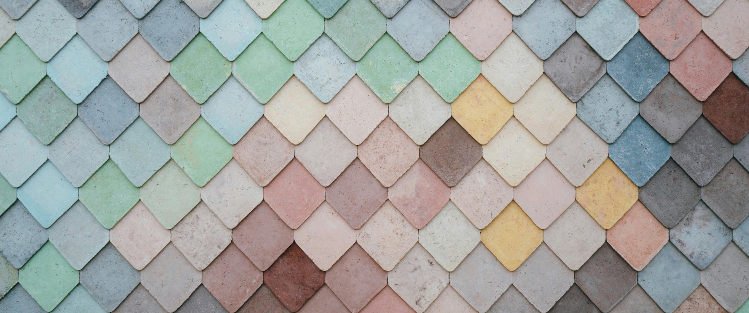
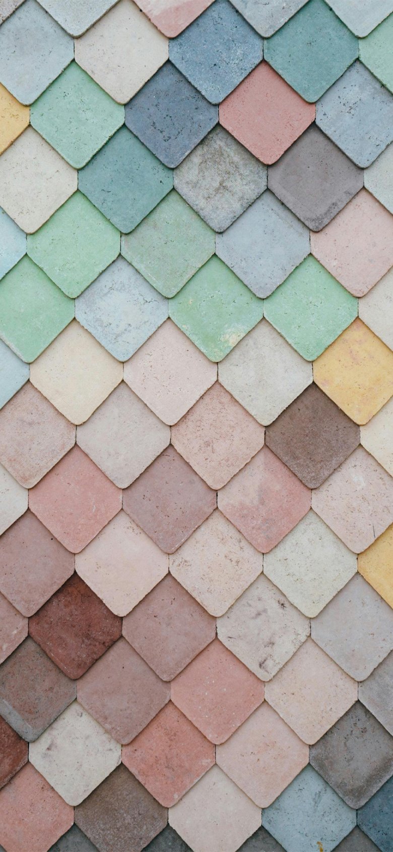
On a psychological level, colors have a significant impact on behavior, productivity, relaxation, and even mental balance. However, not all colors affect people in the same way. For example, cool tones like blue and green are often chosen for spaces dedicated to relaxation and meditation, while warm colors, such as red and orange, are preferred in areas where energy is required, like gyms or spaces intended for dynamic activities.
Perceptive design, however, doesn’t stop at choosing a specific color palette but also focuses on the interaction between color, light, and materials. The relationship between these three elements can indeed create optical and spatial effects that alter the perception of a room. For example, using dark colors on horizontal surfaces can make a room feel lower, while light colors applied to the ceiling can make it appear taller and airier.
If we were to name one individual, it would undoubtedly be Le Corbusier.
In his Polychromie Architecturale, Le Corbusier, a world-renowned architect, developed a color system featuring 63 colors divided into two collections (1931 and 1956). His color choices were not random; each color was carefully selected for its psychological and perceptual properties. Le Corbusier’s palette includes earthy colors such as ochre, brown, and olive green, which evoke stability and solidity, alongside cooler tones like sky blue and gray, which convey lightness and spaciousness.
According to Le Corbusier, color was a fundamental element for altering the perception of space. His “pure” colors were meant to function as tools for articulating spaces and giving them rhythm. A room with blue-painted walls can appear larger and brighter, while a hallway painted in earthy tones feels more solid and welcoming. Le Corbusier's vision of color as an architectural tool revolutionized how architects and designers thought about color in their creations.
Innovative Use of Color in Architecture
Modern architecture has embraced color as a key element, not only for aesthetics but also for functionality and spatial experience. One of the most innovative experiments in this field is by MVRDV, a Dutch studio known for its bold and experimental approach to integrating color in architectural projects.
An iconic example is the "The Imprint" project in Seoul, a complex that plays with the application of colors and textures in unexpected ways. Another project, "Didden Village" in Rotterdam, reflects this chromatic sensitivity, with volumes created on the rooftop of an existing building, characterized by colorful blocks that give a new and distinct identity to the entire structure.
Our Approach to Color and Materials
Our design approach is based on an in-depth analysis of the context and a strong interaction between colors and materials. The use of various surfaces, in combination with selected tones, allows for the creation of visual and tactile effects that enrich the sensory experience of users. An emblematic example is our "Luce Eterna" project, where, during the renovation of the residence, we enjoyed bringing the colors to life as the true protagonists of the space.
In this project, vivid colors like copper-orange are inserted into an almost entirely white environment, radiating the same intensity as a ray of sunshine. This choice not only illuminates but also warms the living area, creating a welcoming atmosphere. Additionally, delicate touches of aquamarine green color the surfaces and custom furnishings in one of the bathrooms, helping to define a perfect space for relaxation. Whether through paints or wallpapers, bursts of color frequently recur in various details of the home, defining unexpected and special corners, like small injections of joy for the future inhabitants.
Every design choice, along with each finish—from the corten steel of the entry staircase to the ribbed oak that conceals the wardrobes in the sleeping area—was designed to enhance the spaces, balance proportions, and give rhythm to the rooms. Most importantly, each element was conceived to welcome and foster a sense of belonging for the new homeowners.
Another example of interesting color usage can be found in the design for the first standalone boutique of the Lucca-based company Roberto Del Carlo, located in the heart of Milan’s fashion district, inside a historic 18th-century building. The space, spread over two levels for a total of approximately 100 square meters, stands out for its “welcoming minimalism,” characterized by the monochromatic gray of the resin floor and concrete-effect plastered walls. These neutral tones create an elegant contrast with the display niches in semi-gloss white Corian embedded in the walls.
LED lighting throughout the area helps create a soft atmosphere, highlighting the colors of the leather goods and the exquisite craftsmanship of the shoes. This approach not only enhances the products on display but also creates a welcoming and refined environment, where each visitor can feel part of a unique experience.
These are examples of how color can be integrated both functionally and conceptually, enriching architecture and transforming ordinary spaces into extraordinary visual and sensory experiences.
Never Forget Two Things: Light and Furniture!
Another essential aspect to consider in color design is light. Natural light changes throughout the day, influencing the perception of color. A space exposed to direct sunlight will have a different color rendering than one illuminated solely by artificial light. The choice of color must therefore take into account light variations, ensuring the environment remains harmonious and comfortable, regardless of the time of day or weather conditions.
In rooms with abundant natural light, dark colors can be captivating, while in dimly lit rooms, it's advisable to opt for light and bright tones.
Of course, we can’t ignore the furniture. Furniture and accessories must interact with the walls, floors, and ceilings to create a harmonious whole. Wooden furniture, for example, pairs well with warm, natural colors, creating a cozy and comfortable atmosphere. In contrast, modern and minimalist furniture, often made from materials like metal or glass, calls for a more neutral or cool color palette to maintain its elegance and visual clarity.
And we could go on forever with endless color combinations reflecting the emotions we want to evoke in those who inhabit a space.
But the point is clear: color design lies at the heart of creating spaces that are not only functional but also capable of improving quality of life. Color thus becomes a powerful tool for influencing mood and perception. Can we say that the right color makes people happy? Maybe, a little bit, yes.


